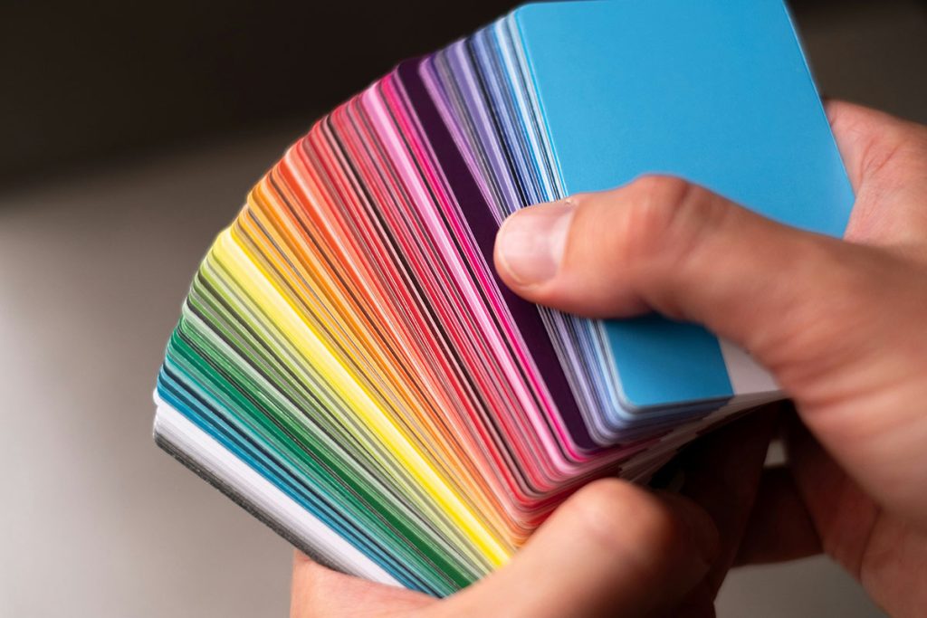
After years of neutral palettes dominating our closets, something vibrant is happening in fashion. People are rediscovering the transformative power of color, not just as a style choice but as a tool for emotional wellbeing. This movement, dubbed “dopamine dressing,” isn’t just another fleeting trend—it’s backed by neuroscience, psychology, and centuries of human experience. The clothes we wear and the colors we choose directly impact our mood, confidence, and how others perceive us. Welcome to the revolution where your wardrobe becomes your personal happiness prescription.
The Science Behind Color and Emotion
How Our Brains Process Color
The connection between color and emotion runs deeper than personal preference. When light hits our eyes, it triggers a complex neurological response that affects everything from our heart rate to hormone production. The wavelength of each color stimulates different areas of the brain, creating measurable physiological and psychological responses.
Red light, with its long wavelength, increases heart rate and blood pressure, creating feelings of excitement and urgency. Blue light, on the shorter end of the spectrum, activates the parasympathetic nervous system, promoting calm and focus. This isn’t pseudoscience—it’s measurable, repeatable neurobiology that explains why we feel energized in a bright yellow room or peaceful near blue water.
The Dopamine Connection
Dopamine, often called the “feel-good” neurotransmitter, plays a crucial role in motivation, pleasure, and reward. When we wear colors that make us feel confident or happy, our brains release dopamine, creating a positive feedback loop. This neurochemical response explains why putting on your favorite bright dress can instantly lift your mood or why that power red blazer makes you feel unstoppable in meetings.
Research from the University of Sussex found that wearing colors we associate with positive experiences can trigger the same neural pathways as the experiences themselves. This means that the coral sundress you wore on vacation can literally transport you back to that beach mindset, complete with the accompanying dopamine boost.
Color Psychology in Fashion
Universal Color Associations
While personal and cultural factors influence our color responses, certain associations appear across cultures:
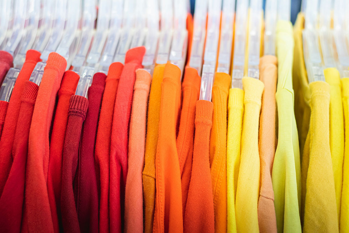
Red: The color of power, passion, and energy. Studies show people wearing red are perceived as more attractive and confident. Athletes wearing red uniforms statistically win more often, possibly due to the psychological edge it provides.
Yellow: Associated with optimism, creativity, and mental stimulation. It’s the first color the human eye processes, making it impossible to ignore. However, it’s also the most fatiguing color in large doses, making it perfect for accents rather than entire outfits.
Blue: The world’s favorite color promotes trust, stability, and calm. It’s why financial institutions love navy and why blue interview suits remain classics. Light blues reduce stress, while electric blues energize without overwhelming.
Green: Nature’s neutral balances and refreshes. It requires no adjustment from the eye, making it the most restful color to process. Forest greens convey growth and stability, while bright greens signal freshness and vitality.
Purple: Long associated with luxury and creativity, purple combines red’s energy with blue’s calm. It stimulates problem-solving and artistic thinking, making it perfect for creative professionals.
Orange: The most divisive color combines red’s energy with yellow’s happiness. It’s associated with adventure, affordability, and youth. In small doses, it’s energizing; in large amounts, it can overwhelm.
Personal Color Psychology
Beyond universal associations, our individual relationships with colors profoundly impact their effect on us. A color linked to a cherished memory or positive experience carries additional emotional weight. This personal color psychology explains why one person’s energizing orange is another’s anxiety trigger.
Consider keeping a color diary for a week, noting how different colors make you feel throughout the day. You might discover patterns—perhaps pastels calm your morning anxiety, or jewel tones boost your afternoon energy. This self-awareness becomes the foundation for strategic dopamine dressing.
The Art of Mood-Boosting Color Combinations
Complementary Colors for Maximum Impact
Complementary colors—those opposite on the color wheel—create the highest visual impact and emotional response. These combinations literally make each other appear brighter:
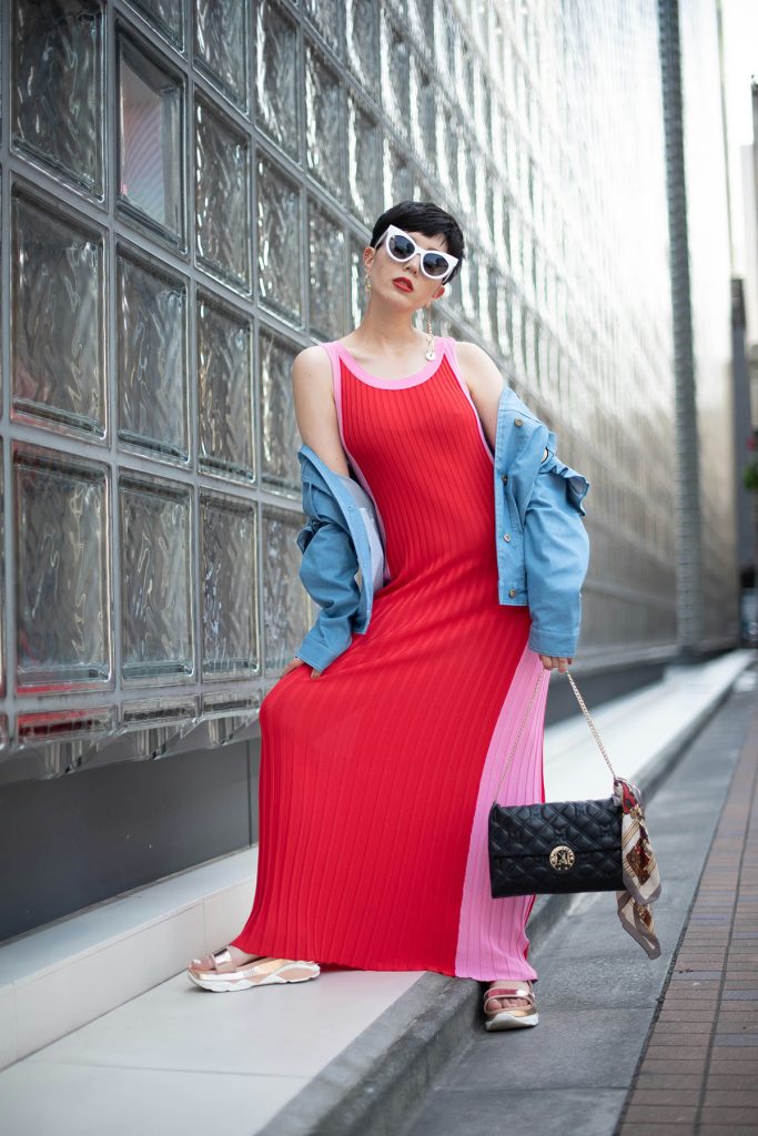
Blue and Orange: This combination balances calm with energy. Try a navy blazer with burnt orange accessories for professional settings, or coral and turquoise for vacation vibes.
Purple and Yellow: Creativity meets optimism in this bold pairing. Lavender and buttery yellow create a softer version, while deep plum and chartreuse make a statement.
Red and Green: Beyond Christmas associations, this pairing works beautifully when properly balanced. Burgundy and sage, or coral and mint, modernize this classic complement.
Analogous Harmony for Subtle Sophistication
Colors adjacent on the color wheel create harmonious, soothing combinations that feel naturally elegant:
Blue to Purple Spectrum: Navy, cobalt, and violet create a rich, sophisticated palette that’s both calming and creative. This combination works particularly well for professional settings where you want to appear both trustworthy and innovative.
Yellow to Orange Gradient: From pale butter through peach to terracotta, this warm spectrum radiates optimism and approachability. Perfect for social situations or creative environments.
Green to Blue Flow: Teal, turquoise, and seafoam create an oceanic palette that’s universally flattering and emotionally balancing. These colors work year-round and complement most skin tones.
The Power of Triadic Combinations
Triadic color schemes—three colors equally spaced on the color wheel—create vibrant, balanced looks that energize without overwhelming:
Primary Power: Red, yellow, and blue in their various iterations create bold, confident looks. Think navy suit, golden accessories, and a pop of burgundy.
Secondary Sophistication: Orange, green, and purple might sound wild, but in muted tones—rust, olive, and plum—they create unexpectedly sophisticated combinations.
Practical Application: Building Your Dopamine Wardrobe

Morning Mood Boosters
Start your day with colors that energize and motivate. If mornings are challenging, incorporate energizing colors into your routine:
- A bright yellow robe or sunny pajamas can help signal wake-up time to your brain
- Orange or coral underwear provides a hidden confidence boost
- A colorful coffee mug or breakfast plate sets a positive tone
For workwear, try incorporating one energizing element into otherwise neutral outfits—a fuchsia blouse under a gray suit, emerald shoes with black basics, or a printed scarf featuring your power colors.
Midday Energy Maintenance
The afternoon slump is real, and color can help combat it. Keep a bright cardigan or colorful accessories in your office for post-lunch energy boosts. Research shows that looking at energizing colors for even 30 seconds can increase alertness and productivity.
Evening Wind-Down Palette
As you transition to evening, shift to colors that promote relaxation:
- Soft blues and lavenders signal your brain to begin producing melatonin
- Warm neutrals like camel and cream create cozy, comforting feelings
- Deep jewel tones satisfy the need for richness while maintaining calm
Strategic Color Placement
The Psychology of Color Proximity
Where you wear color matters as much as which colors you choose. Colors worn near the face have the strongest psychological impact, both on yourself and others:
Near the Face: This is where color has maximum impact. A bright scarf, statement earrings, or colorful collar frames your face and influences how others perceive your mood and energy.
Core Body: Colors worn on your torso affect your personal emotional state more than others’ perceptions. This is where you can be strategic—wear confidence-boosting colors here on challenging days.
Extremities: Colorful shoes, bags, or brightly painted nails provide mood boosts without overwhelming. They’re perfect for color-shy individuals or conservative environments.
Color Blocking for Emotional Balance
Strategic color blocking can create emotional equilibrium throughout your day:
- Pair calming colors up top with energizing colors below when you need steady focus with underlying energy
- Reverse this for presentations—energizing colors up top project confidence while calming colors below keep you grounded
- Use neutral bridges between bold colors to prevent sensory overload
Seasonal Dopamine Dressing
Spring Awakening
As nature rebounds, so should your palette. Spring’s natural color therapy includes:
- Fresh greens that mirror new growth and signal renewal
- Soft pinks and corals that echo blooming flowers
- Sky blues that expand as days grow longer
These colors naturally combat seasonal depression lingering from winter and prepare your mindset for growth and change.
Summer Celebration
Summer’s extended daylight allows for maximum color experimentation:
- Bright whites reflect heat while psychologically cooling
- Tropical brights—turquoise, fuchsia, lime—match summer’s high energy
- Sunset-inspired gradients from yellow through orange to pink capture the season’s warmth
Autumn Grounding
Fall’s color palette naturally supports the transition to introspection:
- Rich burgundies and plums provide warmth without summer’s intensity
- Golden yellows and burnt oranges maintain optimism as days shorten
- Deep teals and forest greens ground and stabilize
Winter Brightness
When natural light diminishes, intentional color choices become crucial:
- Jewel tones—sapphire, emerald, ruby—provide richness against winter’s gray
- Unexpected brights—hot pink, electric blue—combat seasonal affective disorder
- Metallic accents add light reflection, boosting mood through shimmer and shine
Cultural Considerations and Color
Global Color Languages
Color meanings vary across cultures, making dopamine dressing a personally and culturally informed practice:
- Red signifies luck and prosperity in many Asian cultures, making it a powerful choice for important events
- White represents mourning in some Eastern cultures but purity in Western ones
- Purple’s association with royalty is nearly universal, though its specific meaning varies
Understanding your cultural relationship with color deepens your dopamine dressing practice and helps you make more intentional choices.
Breaking Color Rules
Traditional color “rules”—no white after Labor Day, no mixing navy and black—increasingly feel outdated. Dopamine dressing encourages breaking these rules if doing so brings joy. The only rule that matters: does this color combination make you feel good?
Implementation Strategies
The Gradual Approach
For those emerging from years of black-and-neutral dominance, jumping into full color can feel overwhelming. Start small:
- Week 1-2: Add one colorful accessory daily—a bag, shoes, or scarf
- Week 3-4: Introduce one colorful garment into otherwise neutral outfits
- Week 5-6: Try color combinations, starting with analogous schemes
- Week 7-8: Experiment with complementary colors and bolder choices
The Color Challenge Method
Alternatively, dive in with structured challenges:
- Rainbow Week: Wear a different color each day, noting mood impacts
- Monochrome Monday: Dress in shades of one color to explore its full emotional range
- Complementary Tuesday: Practice high-impact pairings
- Wild Card Wednesday: Try colors outside your comfort zone
Building a Dopamine-Driven Closet
Transform your wardrobe into a mood-boosting arsenal:
- Audit Existing Pieces: Identify which colors you already own and how they make you feel
- Identify Gaps: What moods or emotions lack color support in your wardrobe?
- Strategic Shopping: Buy colors that support your emotional and lifestyle needs
- Organize by Mood: Group clothes by the feelings they evoke rather than traditional categories
The Future of Dopamine Dressing
As our understanding of neuroscience and color psychology deepens, dopamine dressing will likely become more sophisticated. Imagine smart fabrics that change color based on biometric feedback, or AR applications that suggest colors based on your morning mood scan.
But the core principle remains timeless: the colors we wear profoundly impact how we feel and how we move through the world. By choosing colors intentionally—based on both scientific understanding and personal experience—we transform getting dressed from routine task to daily opportunity for joy, confidence, and emotional wellbeing.
The dopamine dressing revolution isn’t about following rules or trends. It’s about recognizing that you have the power to influence your mood, energy, and confidence through something as simple as color choice. Your wardrobe isn’t just fabric and thread—it’s a toolkit for emotional regulation, self-expression, and daily doses of happiness. The question isn’t whether color affects your mood—science has proven it does. The question is: how will you use this knowledge to create a life filled with more joy, one outfit at a time?
Frequently Asked Questions
Q: Can dopamine dressing work if my workplace has a strict dress code?
A: Absolutely! Even in conservative environments, you can incorporate mood-boosting colors through accessories, undergarments, or subtle details like colorful linings, pocket squares, or jewelry. The key is finding permissible ways to add color.
Q: I look terrible in yellow but research says it’s energizing. What should I do?
A: Not every color works for every person. Find your version—maybe mustard, gold, or cream gives you yellow’s benefits while flattering your skin tone. Also, you can wear challenging colors away from your face or in small doses.
Q: How do I know if a color combination is working for my mood?
A: Pay attention to how you feel 10-15 minutes after putting on an outfit. Do you feel energized? Confident? Calm? Your body’s response will tell you if the colors are working. Keep notes to identify patterns.
Q: Is it possible to overdo dopamine dressing?
A: Yes, too much bright color can be overstimulating. Balance is key—mix energizing colors with neutrals, and consider your daily activities. High-energy colors work better for active days than meditation sessions.
Q: Do these color principles apply to men’s fashion too?
A: Definitely! Color psychology is universal. Men can apply these principles through shirts, ties, pocket squares, socks, or even colorful watch bands and phone cases. The emotional impact remains the same regardless of gender.