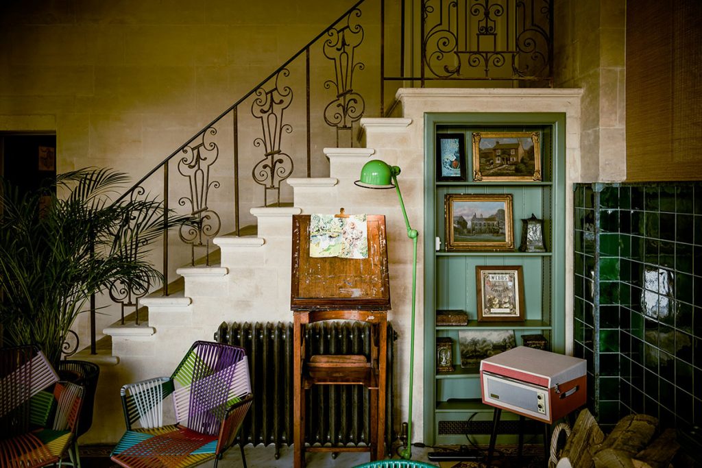
The principles that make your personal style cohesive and compelling work just as powerfully when applied to interior design. If you’ve mastered the art of creating a harmonious wardrobe through strategic color coordination, seasonal rotation, and accent piece integration, you already possess the skills needed to transform your living space into a beautifully curated environment. The same psychological triggers that make certain color combinations feel “right” in fashion translate seamlessly to home décor, creating spaces that feel as intentionally styled as your best-dressed days.
Color psychology operates consistently across all design disciplines because human responses to color remain constant whether we’re choosing an outfit or selecting paint samples. The confidence you feel wearing your favorite color combination can be recreated in your living room through the same strategic color relationships. Understanding how to translate these wardrobe wisdom principles into interior design creates homes that feel as personally authentic and visually sophisticated as carefully curated personal style.
Building Your Home’s Foundational Color Palette
The Capsule Wardrobe Approach to Room Design
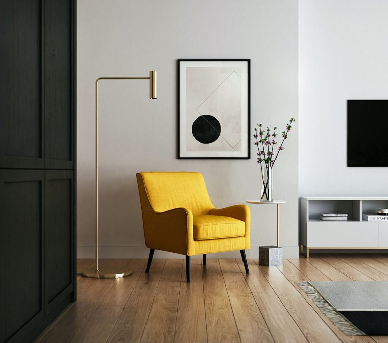
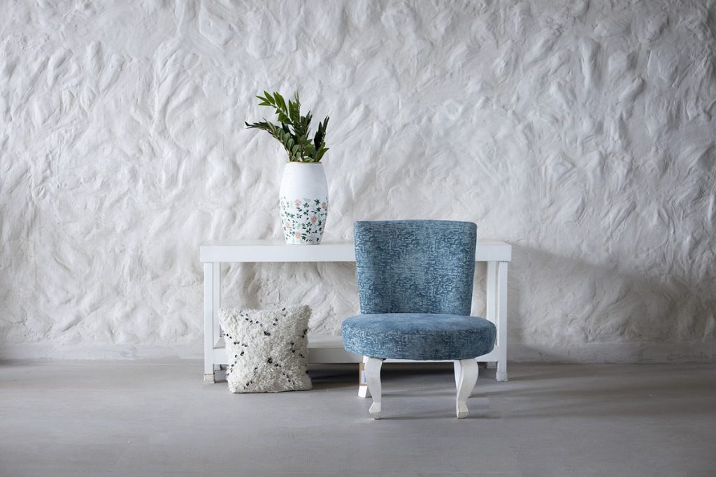
Just as successful wardrobes rely on versatile foundation pieces in neutral colors, effective room design starts with a carefully selected base palette of 2-3 colors that work harmoniously together. These foundational colors – typically applied to walls, major furniture pieces, and flooring – function like your wardrobe’s black pants, white shirts, and neutral blazers that coordinate with multiple accent pieces.
Choose your home’s foundation colors using the same criteria you apply to wardrobe basics: they should work across seasons, complement your lifestyle, and provide a backdrop that enhances rather than competes with accent elements. Warm whites, soft grays, and muted earth tones serve as excellent foundational choices that mirror the versatility of classic wardrobe neutrals.
Personal Color Analysis for Living Spaces
The colors that flatter your complexion often translate beautifully into home environments where you’ll feel most comfortable and confident. If warm undertones make your skin glow, consider incorporating similar warm hues into your home palette through golden whites, peachy beiges, and rich wood tones that create the same harmonious effect.
Cool-toned individuals who gravitate toward blue-based colors in their wardrobes often feel most at ease in homes featuring crisp whites, cool grays, and blue-green accents that reflect their natural color preferences. This alignment between personal coloring and environmental palette creates psychological comfort that enhances daily living experiences.
Creating Color Harmony Through Undertone Consistency
Professional stylists understand that successful color coordination relies on undertone matching – ensuring all colors share either warm or cool undertones for seamless harmony. Apply this same principle to home design by selecting colors within the same undertone family, whether you choose warm-based palettes featuring golden yellows and peachy pinks or cool-based schemes incorporating blue-grays and silvery greens.
Mixed undertones create the same visual discord in interiors that they produce in fashion – beautiful individual pieces that somehow don’t work together cohesively. Maintain undertone consistency across all elements from wall colors to accent accessories for professional-level interior harmony.
Seasonal Color Transitions for Dynamic Living
Wardrobe Rotation Strategies for Home Accessories
Fashion enthusiasts understand the psychological boost that comes from seasonal wardrobe transitions, and the same principle applies to home styling. Rather than completely redecorating each season, rotate accessories, textiles, and small décor elements to refresh your environment while maintaining core foundational investments.
Spring calls for lighter textiles and fresh accent colors that mirror the season’s wardrobe shift toward brighter hues and lighter fabrics. Summer accessories in crisp whites and ocean blues replace winter’s rich burgundies and deep forest greens, creating environmental changes that align with natural seasonal rhythms and fashion cycles.
Layering Techniques for Year-Round Adaptability
Master fashion layering translates directly into home styling through strategic textile layering that can be adjusted seasonally. Lightweight cotton throws for summer layer beautifully over neutral furniture, while heavier wool blankets and velvet pillows add warmth and richness during colder months.
This layering approach prevents the expense and waste of complete seasonal redecorating while providing the psychological satisfaction of environmental change that mirrors seasonal wardrobe evolution. Base furniture pieces remain constant while accent layers adapt to seasonal mood and practical comfort requirements.
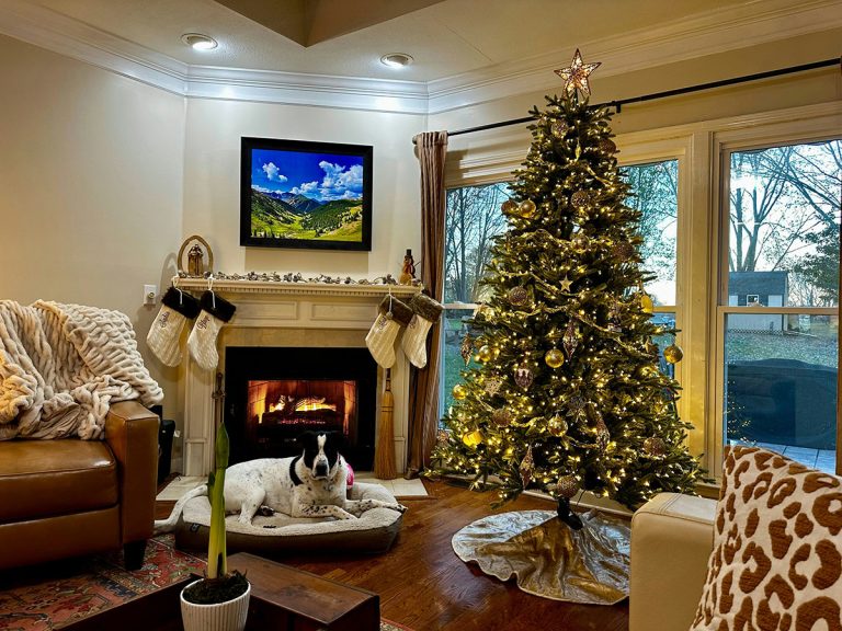
Color Temperature Adjustments for Seasonal Comfort
Understanding how lighting affects color perception in fashion helps create successful seasonal home transformations. Warm lighting enhances autumn and winter color palettes featuring deep burgundies and golden browns, while cooler lighting temperatures complement spring and summer palettes of fresh greens and ocean blues.
Adjust your home’s lighting temperature seasonally to support your chosen color story, just as you might choose different makeup undertones to complement seasonal wardrobe choices. This technical adjustment dramatically impacts how colors appear and feel in your living environment.
Statement Pieces vs Supporting Elements
Treating Furniture Like Investment Fashion Pieces
High-quality furniture pieces function like investment fashion staples – timeless designs in neutral colors that provide long-term value and versatility. A well-designed sofa in classic proportions and neutral upholstery serves the same role as a perfectly tailored blazer, providing a foundation that works with multiple styling approaches across years of use.
Invest in furniture pieces that mirror your approach to wardrobe investment pieces: classic proportions, quality construction, and neutral colors that won’t look dated as trends evolve. These foundational elements support multiple decorating approaches while maintaining their relevance and functionality over time.
Accent Accessories as Fashion Statement Pieces
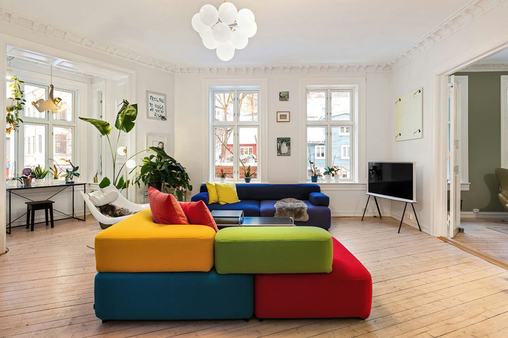
Home accessories function exactly like fashion accessories – they provide personality, color interest, and trend relevance while being easily changeable as tastes evolve. Colorful throw pillows, artwork, and decorative objects serve the same role as statement jewelry, bold handbags, and trendy shoes in personal styling.
Choose accent pieces that reflect current trends or seasonal preferences while keeping foundational elements neutral and timeless. This approach allows frequent style updates without major financial investments, mirroring successful fashion styling strategies that maximize wardrobe versatility.
Balancing Classic and Trendy Elements
Fashion stylists understand the importance of balancing timeless pieces with current trends, and home styling benefits from the same approach. Classic furniture silhouettes and neutral foundation colors provide stability, while trendy accent colors and contemporary accessories add current relevance and personal expression.
Limit trendy elements to easily changeable accessories and textiles, just as fashion-conscious individuals might incorporate trendy pieces through accessories while maintaining classic foundational garments. This strategy prevents costly decorating mistakes while keeping homes feeling current and personally relevant.
Color Psychology Applications for Different Rooms
Bedroom Styling Using Intimate Apparel Principles
Bedroom color choices should create the same sense of personal comfort and confidence that well-chosen intimate apparel provides. Soft, flattering colors that make you feel relaxed and attractive work beautifully in bedroom environments where personal comfort takes priority over public presentation.
Consider the colors that make you feel most beautiful and confident when choosing bedroom palettes. Warm, muted tones often work better than bold, energizing colors for spaces designed for rest and relaxation, mirroring the comfort-focused color choices in sleepwear and intimate fashion.
Living Room Design Through Social Wardrobe Logic
Public living spaces benefit from the same color psychology that guides social wardrobe choices – colors that project confidence, welcome interaction, and photograph well under various lighting conditions. The colors you choose for important social events often translate beautifully into living room palettes that support entertaining and daily family interaction.
Rich, sophisticated colors that photograph well and maintain their appeal under different lighting conditions work excellently in living spaces where you’ll welcome guests and create lasting memories. These colors should reflect your personality while creating welcoming environments for social interaction.
Kitchen Color Strategy Using Professional Wardrobe Principles
Kitchen color choices benefit from professional wardrobe psychology – colors that promote efficiency, maintain their appearance through heavy use, and create energizing environments that support productive activity. The same colors that make you feel competent and energized in professional settings often work beautifully in kitchen environments.
Clean, crisp colors that hide wear and maintain their appearance through frequent use mirror the practical color choices in professional wardrobes. These palettes should balance aesthetic appeal with practical durability requirements specific to cooking and food preparation environments.
Proportion and Scale Translation
Understanding Visual Weight in Both Fashion and Interiors
Fashion styling teaches important lessons about visual weight distribution that apply directly to interior arrangement. Heavy textures, dark colors, and large patterns create visual weight that must be balanced thoughtfully, whether in outfit coordination or room design.
Distribute visual weight evenly throughout rooms using the same principles that create balanced outfit proportions. If you understand how to balance a bold patterned top with simple bottoms, you can apply the same logic to balance statement wallpaper with simple furniture or bold artwork with neutral surroundings.
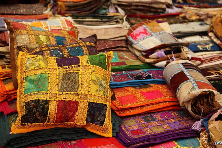
Pattern Mixing Mastery from Wardrobe to Walls
Successful pattern mixing in fashion requires understanding scale relationships, color coordination, and visual balance – skills that translate directly to interior pattern integration. The same rules that govern mixing striped shirts with patterned scarves apply to combining wallpaper patterns with textile prints in home décor.
Master pattern mixing by starting with one dominant pattern and adding smaller-scale coordinating patterns in related colors, just as successful fashion pattern mixing relies on scale variation and color harmony for cohesive results.
Personal Style Authenticity in Home Expression
Translating Fashion Personality Into Environmental Design
Your personal fashion style preferences provide valuable insights into the home aesthetic that will feel most authentically you. Minimalist dressers often feel most comfortable in clean, uncluttered interiors, while those who love layered, textural fashion typically prefer homes with rich textile mixing and collected accessories.
Analyze your wardrobe preferences for clues about your ideal home environment. Pattern lovers, color enthusiasts, and texture collectors can embrace these same preferences in their interior design choices for authentic personal expression that feels natural and sustainable.
Creating Signature Style Elements
Just as fashion stylists develop signature elements that define their personal aesthetic, home styling benefits from consistent signature elements that create recognizable personal style. These might include preferred color families, specific textile preferences, or particular design elements that appear throughout your home.
Develop home styling signatures the same way you’ve developed fashion signatures – through experimentation, refinement, and consistent application of elements that feel authentically you. These signatures create coherence across different rooms while maintaining personal authenticity and style recognition.
Frequently Asked Questions
Q: Can I use the exact same colors from my wardrobe in my home décor?
A: Yes, but consider how colors appear under different lighting conditions and in larger quantities – sometimes lighter or more muted versions work better for walls and major pieces.
Q: How do I adapt seasonal color changes from fashion to home decorating?
A: Focus on easily changeable elements like throw pillows, blankets, and accessories rather than major furniture pieces, rotating these seasonally like wardrobe accessories.
Q: What if my favorite clothing colors don’t work well as room colors?
A: Use your favorite colors as accent shades through artwork, textiles, and accessories while choosing more livable versions for walls and major furniture pieces.
Q: How many colors should I use in a room, similar to outfit coordination?
A: Follow the fashion rule of 3-4 colors maximum per room – one dominant neutral, one secondary color, and 1-2 accent colors for visual interest without chaos.
Q: Can I mix warm and cool colors in home décor like I do in my wardrobe?
A: It’s more challenging in interiors than fashion – stick to one undertone family per room for better harmony, though you can mix undertones across different rooms.